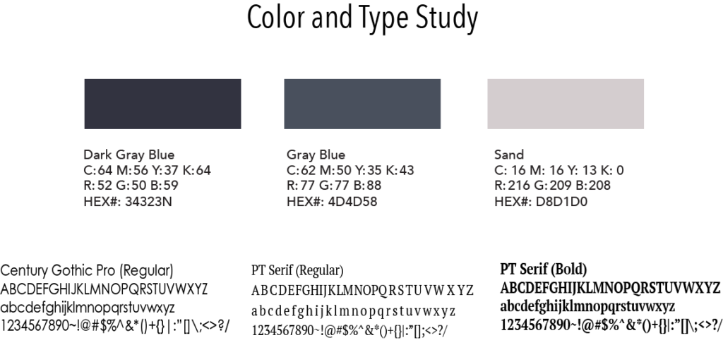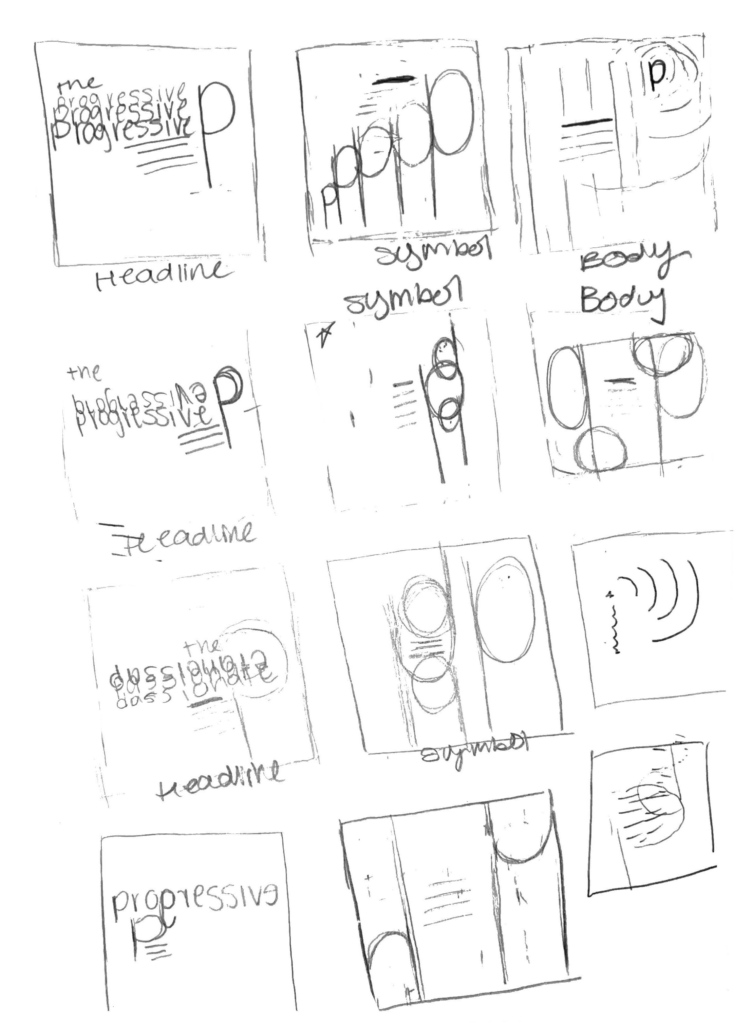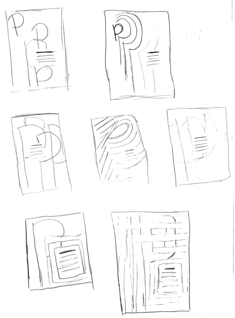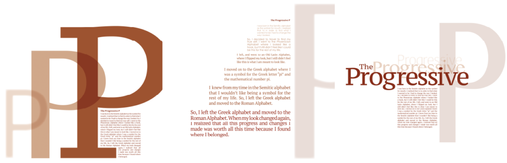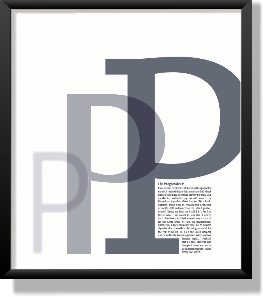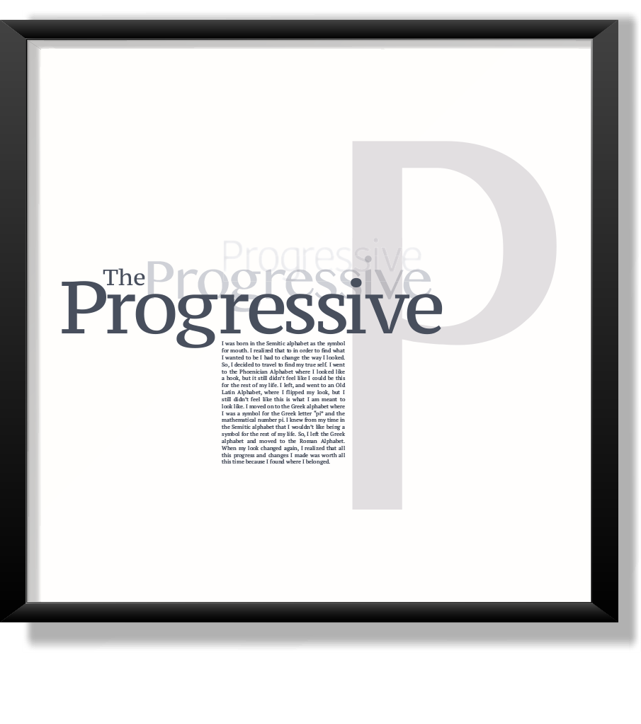
The Letter History project inspired designers to create a story about how a letter from the alphabet came to its current form. I chose the letter P as my focus because of my last name. When I researched this letter, I realized how much it had changed throughout the centuries of typography. I created three posters focused on the body copy, headline, and symbol. Each sign uses a sans serif and a serif font to represent the progression of the letter P. The three colors I chose are a light beige, a grey blue, and a darker grey blue. In the posters, these colors emphasize the change throughout the sign, and the letter P. Going from the light color to the darkest color in each poster shows this very well. Throughout all three posters, various effects create the feeling that the design and the meaning are that there was a change in the letter P. The effect used on each of the posters is the feather effect, which gives the unfinished feel to the type. I decreased each color’s tint to get a lighter shade of the color used. Both help the overall design help demonstrate progression throughout each poster.
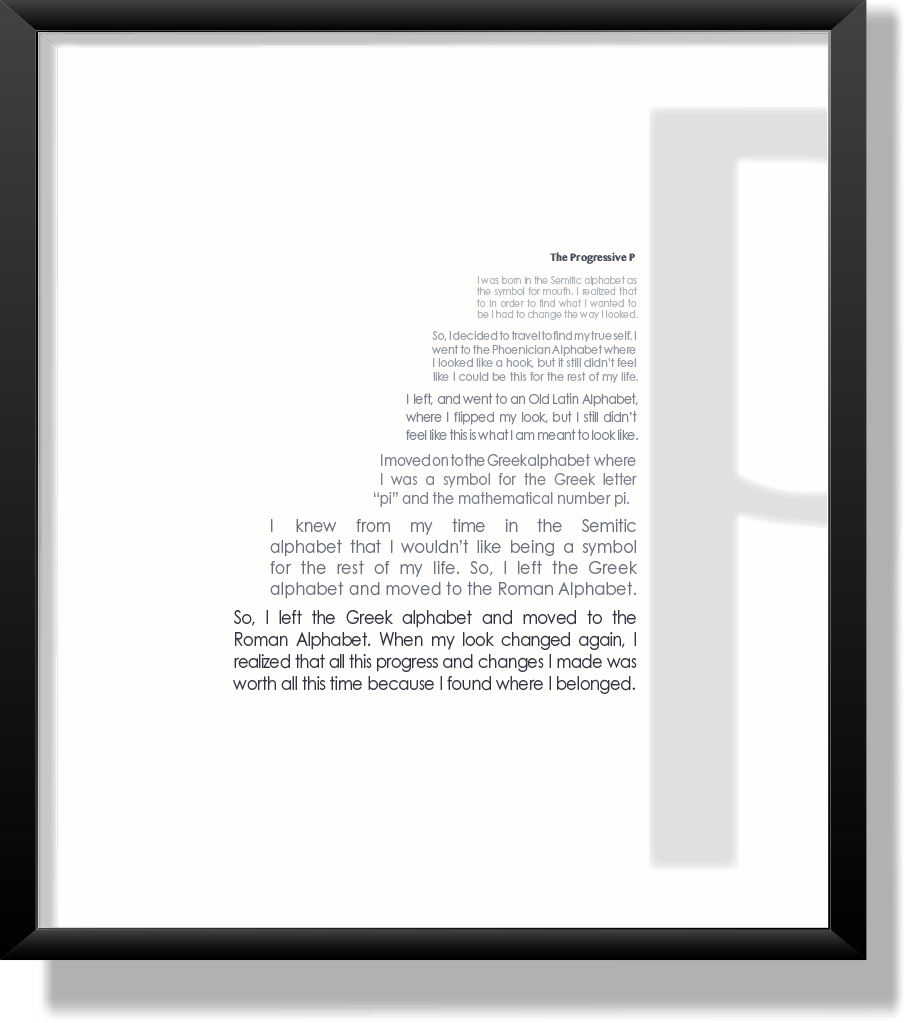
In the body paragraph poster, the story I created of the letter “P” starts small in a light color. As the audience moves their eye down, each sentence continues to change into the serif font and the darker pigment used. This is an excellent example of how the letter P has changed. The symbol and headline poster has a feather effect, and the opacity was brought down on the small and middle letter. As the P on the sign gets more prominent and darker, the feather effect slowly disappears to show the audience what the symbol of the letter P is now.