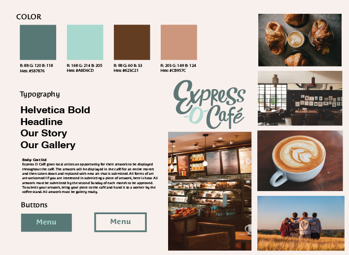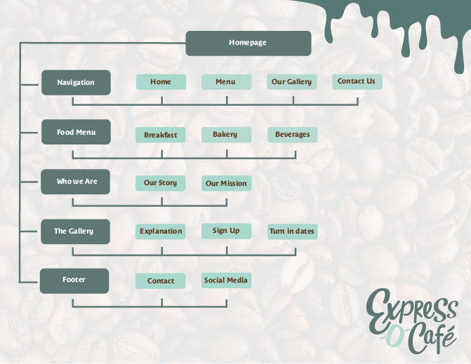
Express -O- Café is an interactive page for customers to explore the café from online. Throughout images from the existing brand identity are used to tie in what Express -O- Café is. Before creating the website, site map and style tile were created to give an overall feel of the websites aesthetic. The sitemap tells the hypothetical clients that it is a one-page website with 5 different tabs, which include, What’s Happening, Menu, Gallery, Merchandise, and About Us. The site map gives the client the feel for what the site is going to be and what images are going to use. The site tile shows the audience that the Express -O- café is going to use warm tones of color, and the fonts that are used throughout the site.
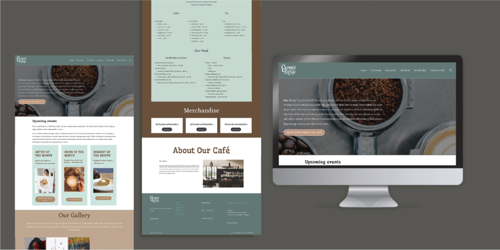
The website, shows the audience what they may in the other items of the brand. For instance the website features the drink, dessert, and artist of the month. It also talks to the about the merchandise that the store holds, and it gives more information of the gallery.
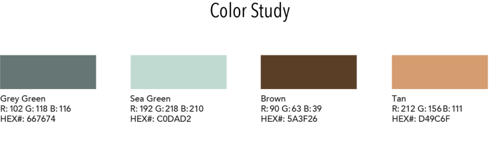
Throughout the website, the same colors, greens and browns, were used to keep the aesthetic. Some of the images were also used to transfer over the warm and welcoming feeling. The fonts used for the header is a Creative Serif font that is used to bring the creativity side of the café. The body copy is Times New Roman font for the users to read easily.