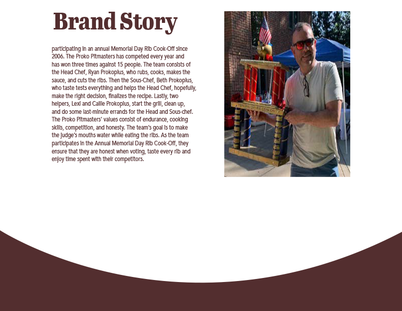
Proko Pitmasters is a barbecuing team that competes at a family cook off on every Memorial Day weekend. The team consists of head chef, sous-chef, and assistants. This is a family-based team where they all direct each other.
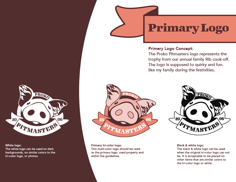
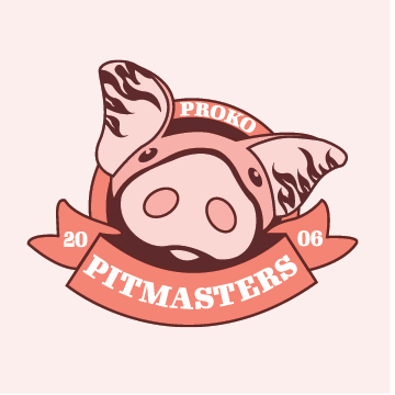
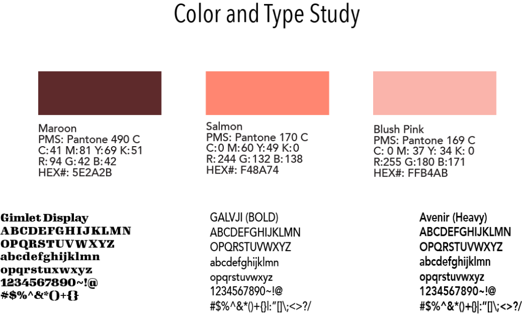
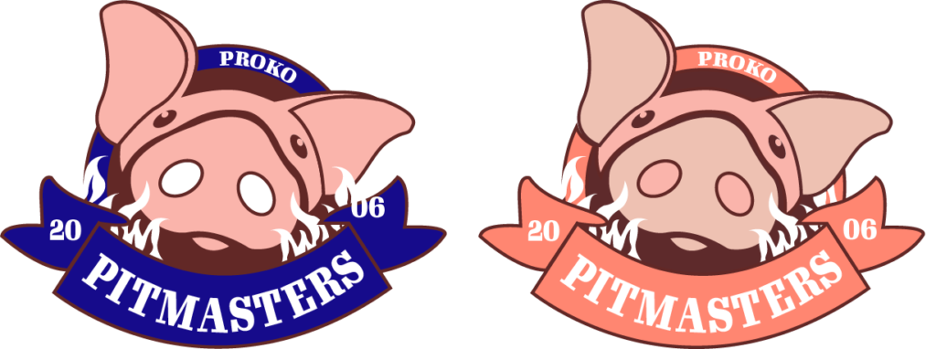
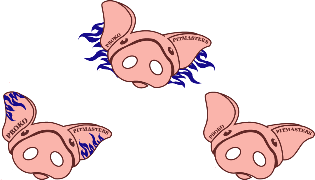
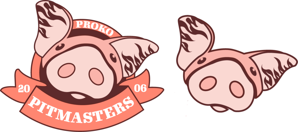
The illustrated pig is inspired by the trophy that is awarded to the winner of the rib cook off. The colors, pink and maroon, represent the colors of pigs, and barbequing. The bold type, Gimlet Display, ensures that the viewers, or the opposing teams can read the name of Proko Pit masters. The overall brand identity has repeating elements like the curve and the flames from ears of the pig. The flames are another representation the competition the team is on.
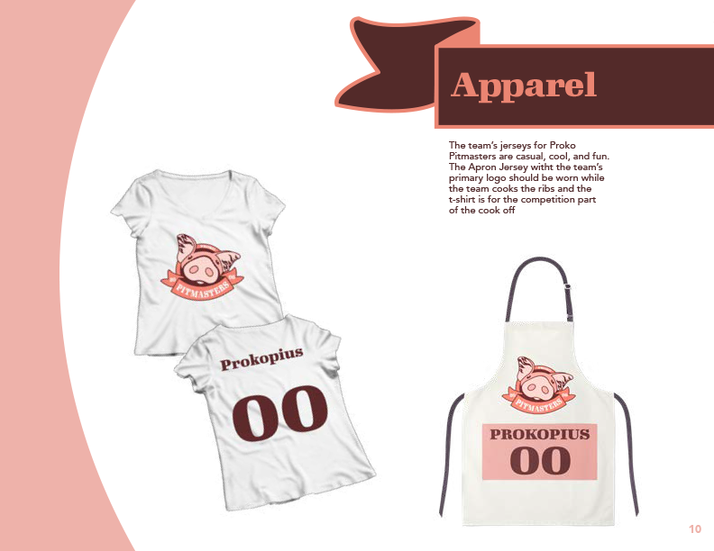
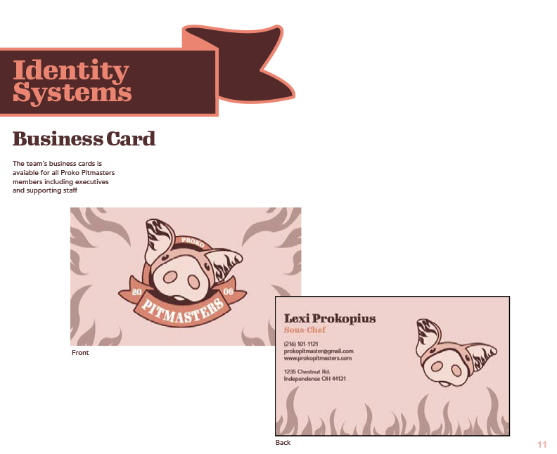
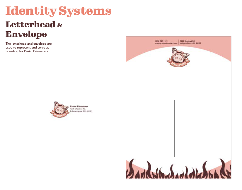
Each team member obtains a business card, which uses the flames, and Gimlet Display font. The team also uses letterheads and envelopes which contain the logo and the address of the home address of the team. Each team member also gets two different kinds of jerseys, one of which is an apron which will be used for when the team is cooking, and then a t-shirt is to be worn at the competition.
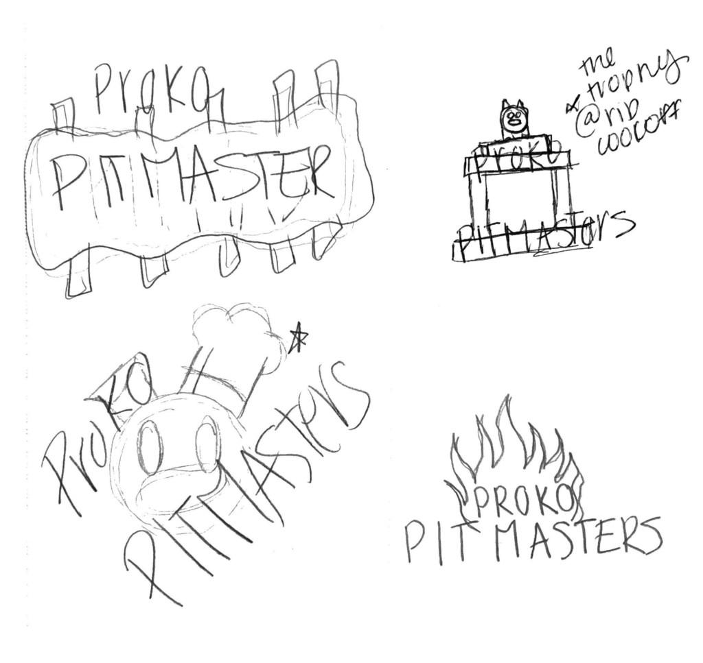
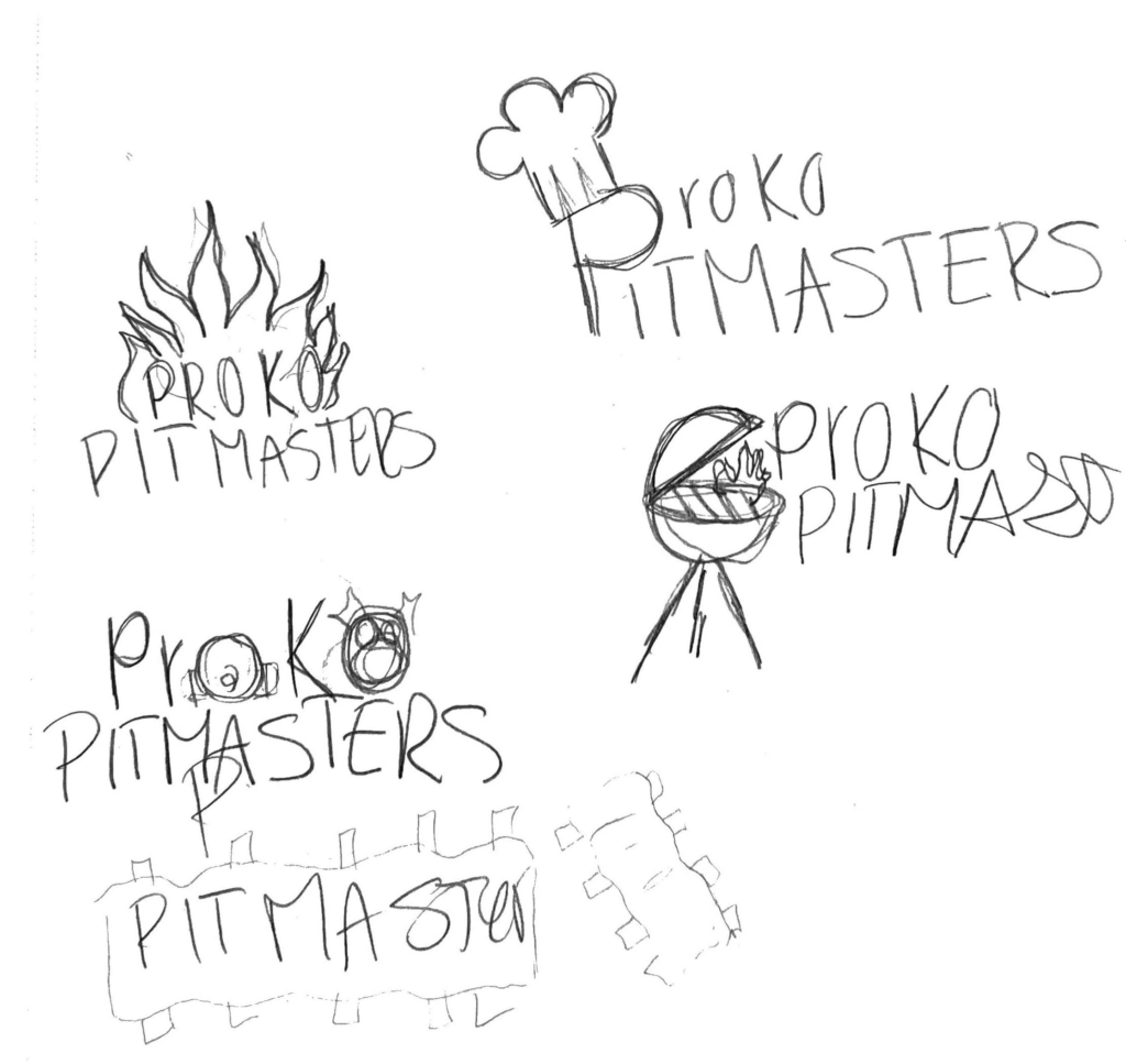
Logo Sketches
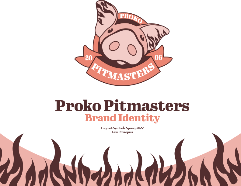
Proko Pitmasters Brand Identity