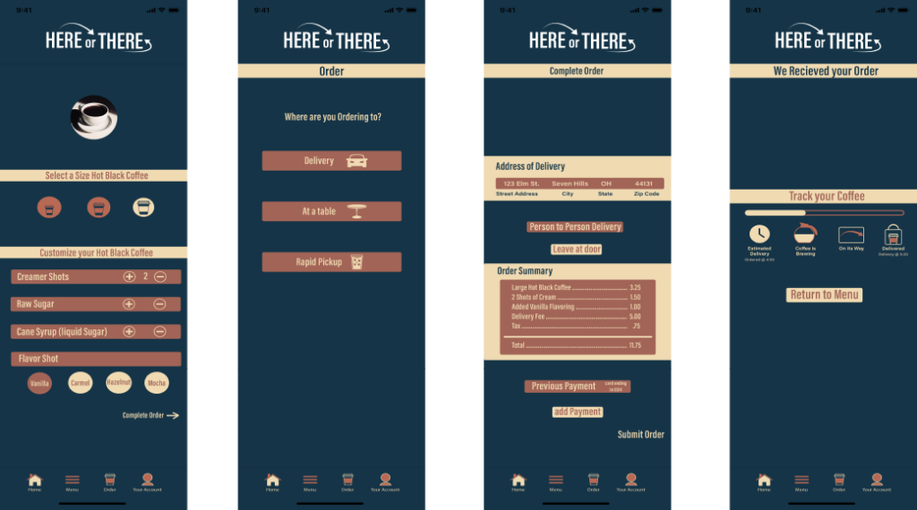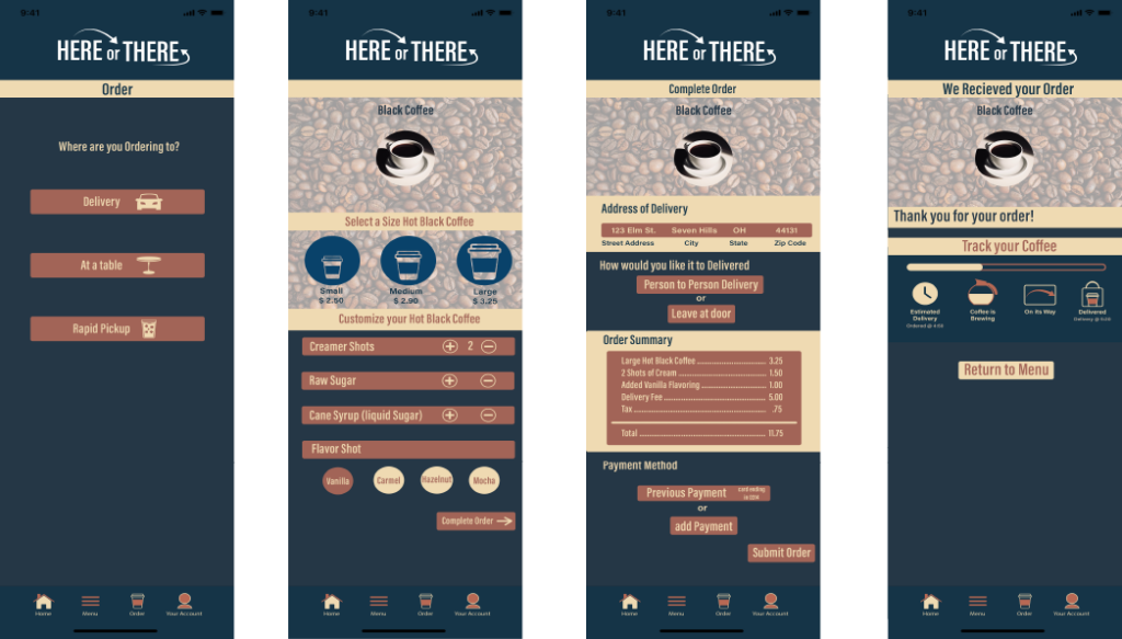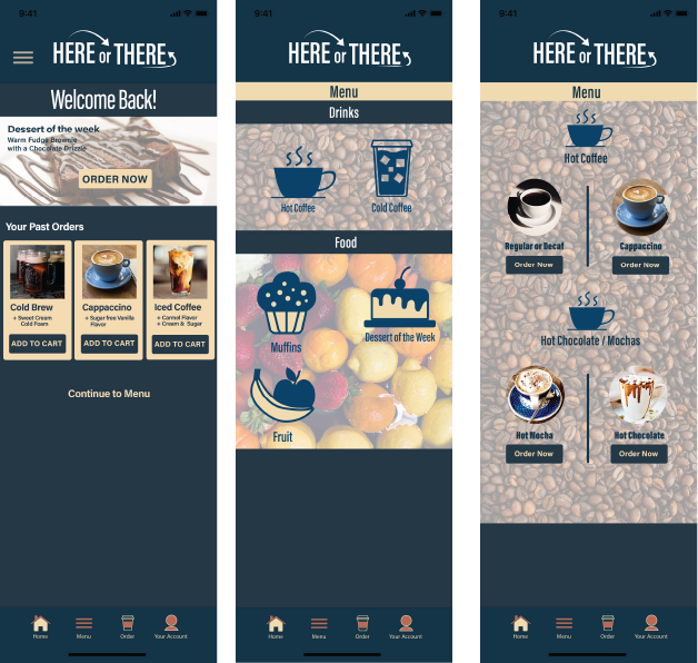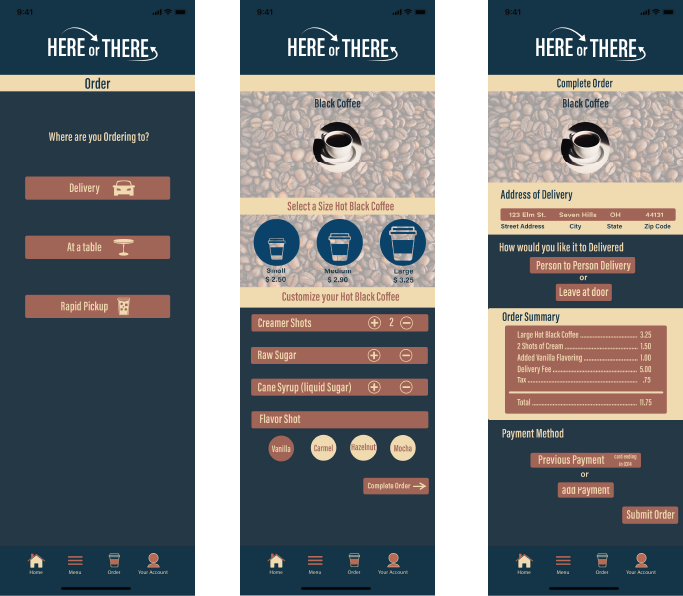
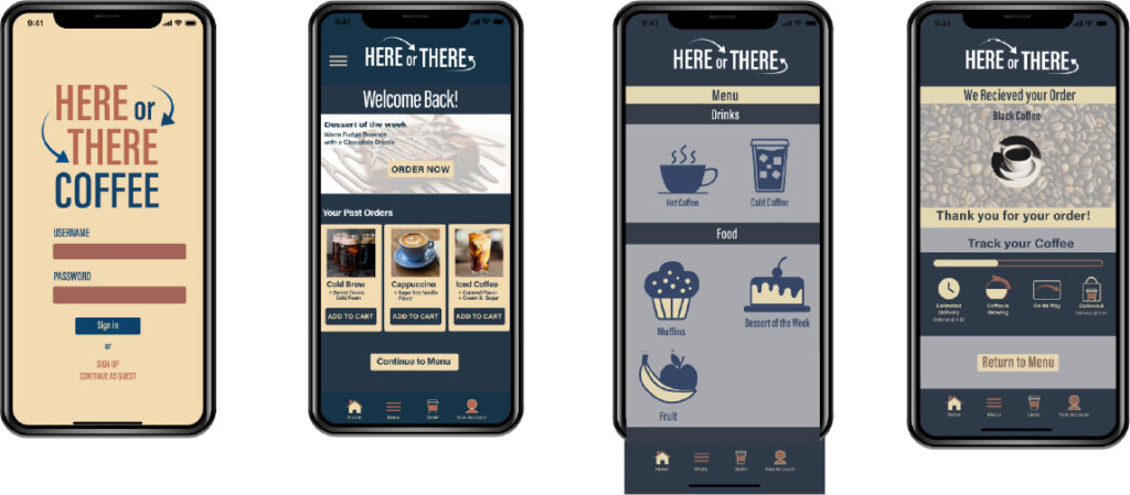
For this project we had to create an app with 10 icons, and 6 different pages, then put them into a user testing website. “Here or There Coffee” is a coffee house that offers a customer to order coffee for delivery, rapid pick up, or at a table. This concept was sparked because right now when coffee is delivered, one would have to go through DoorDash or Uber Eats and pay the delivery fee.
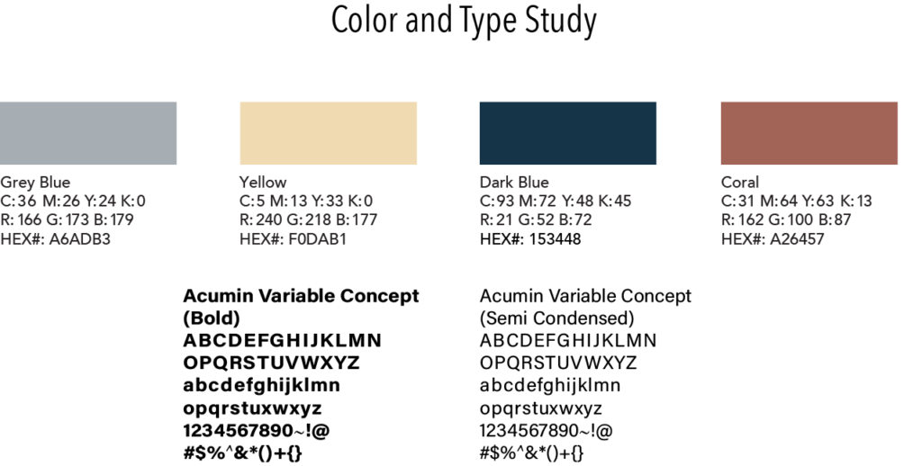
As for the design, the colors give off a coffee aesthetic, with the burnt orange and tan but also welcoming feel, with the dark blue and yellow. These colors work great together and make relay to the audience. The fonts that were used throughout my logo, and interface is the Acumin Variable Concept and Extra Condensed Semibold font. The logo type uses the arrows to implement the here and there of the business.
During the design the most difficult part is trying to figure out a layout that is easy for the audience to navigate. The buttons and the pictures had to be big enough for people to see and be able to press. The order of each of the pages also made it easier for the users to navigate and find out more about the company, and the products it offers.